Skip navigation

Tag Archives: product

In my path to becoming a well-rounded photographer, I decided I needed to have a little bit of product photography under my belt. The next step on this path was to tackle a difficult subject: metal.

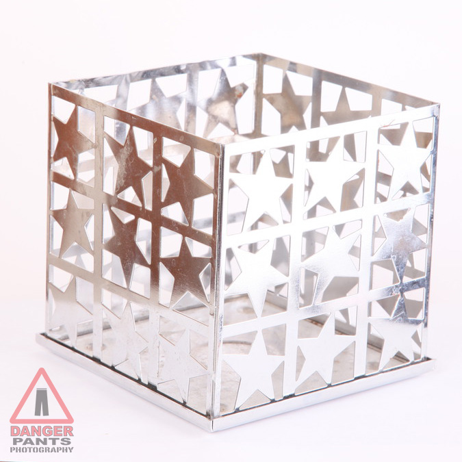
Photographing metallic objects is hard because the light is comparatively difficult to get right. It’s easy enough to throw up some light and end up with a picture. However, that picture will be flat and uninteresting, and probably won’t look much like metal. We’ve got a visual vocabulary for metallic objects now, after a hundred and fifty years of photography, and thousands of years of painting. You expect to see the metal object show a range of tones from near black to near white. Color doesn’t really look right, unless it’s a very lightly tinged blue color. You typically want to see a curving line, if you see a line at all, where light and dark meet on a smooth surface. Here’s an example of not doing it right:

img_9005

There are too many bright tones, and no real dark tones to speak of. The left side is showing a distinct orangey color from the wall and the shades. I also didn’t realize how dirty my product was until after I reviewed the first batch of photos. It still looks like metal, but it doesn’t look very good. This was with two lights, and was the first shot I took of this object.

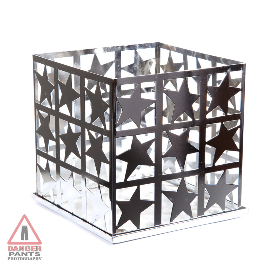
I went through a series of photos after this, moving lights, removing umbrellas, moving again, shifting camera angles, cleaning my subject, eventually adding lights until I had every strobe I own trained on the thing. I finally had a result I was pretty happy with (although ideally I would clean more of the wax off of it):

IMG_9038

It looks like metal. It has a bit of a highlight on the otherwise-dark side. It’s cleaner.

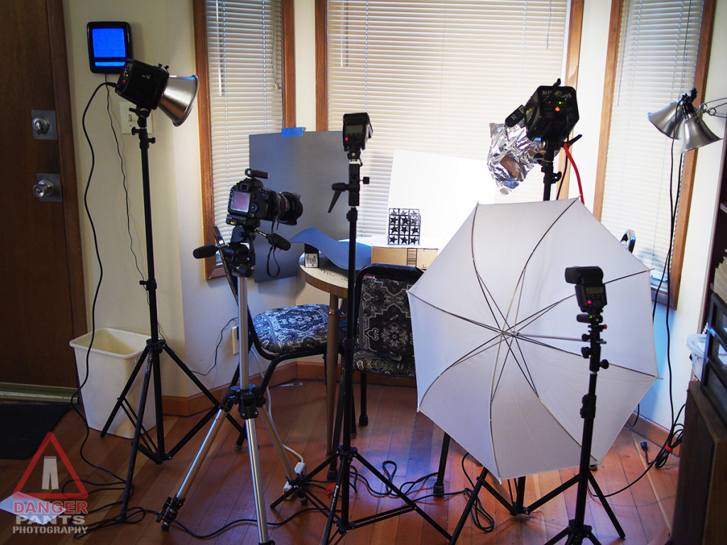
And the inspiration for this whole post? The crazy-looking setup it took to get here:

OLYMPUS DIGITAL CAMERA

Although I’ve been focusing on people for most of my photography career, I also find myself occasionally tripping past other types of photography and looking in as I go by. One of those is product photography.

Product photography is an interesting area, since it looks so simple from the outside, and can be challenging to really get right. It’s not hard to take a picture of a widget. It’s much more demanding to take a picture of a widget and make it look both correct and appealing. Lighting has to be very particularly set up, and the needs of the customer can radically change the shot — is this a catalog shot? A marketing shot? What is the goal of the marketing campaign? The look for a bottle of hair product may or may not be utterly different from the look for a handgun. It’s hard to imagine lumping those products together, but I could easily imagine a lighting and background setup that would accommodate either.

My first attempt at a product shot demonstrated just how hard it is. I borrowed a decorative toy bird from a friend, since I wanted something whimsical, and my own possessions didn’t yield anything I’d want to call a portfolio shot of a whimsical thing. I shot it against a brightly colored background (boring), and against a colored background with glittering faux jewels strewn around (more interesting, but definitely not right). The lighting was ok, but the setting was just kind of bleh.

Then one morning I awoke to an inch or two of snow, and immediately knew the solution to my dilemma. I grabbed the bird, and perched him on a handy railing. Instantly, an interesting, evocative shot. Snow underneath, trees forming the out-of-focus backdrop; it was ideal.

Are those rockers or skis?

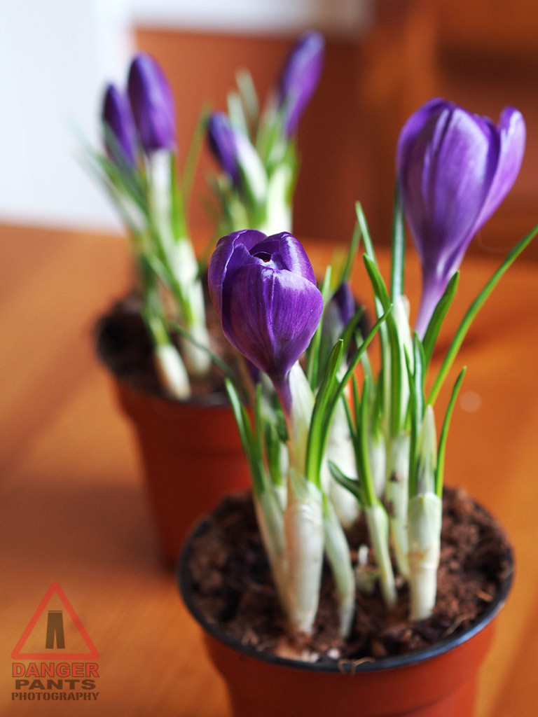
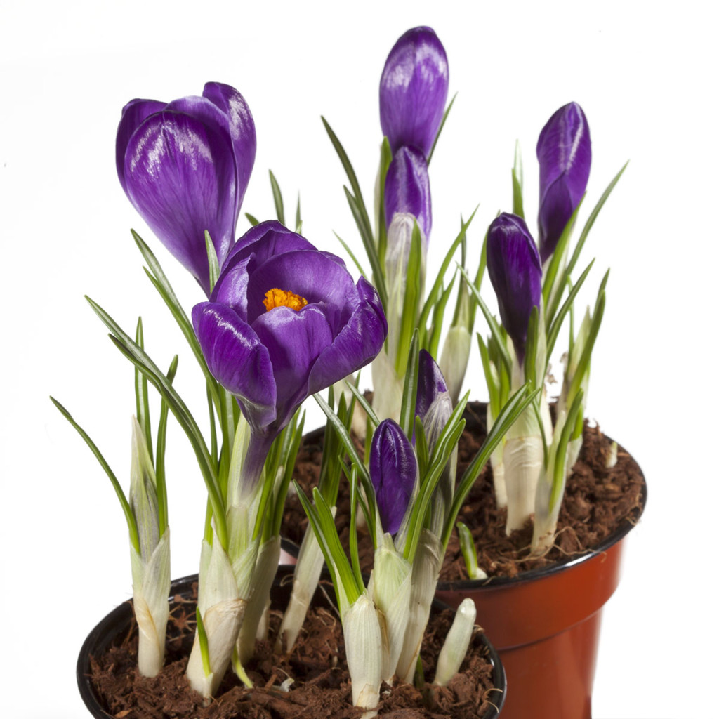
Next up, I was approached about taking pictures for an Amazon web store. Amazon allows resellers to list their stuff through the Amazon site, as you probably know. But the product photography isn’t included, and the quality of images ranges from professional to abysmal. This request was for a nursery which sells bulbs that grow into lovely flowers, and we had some fresh-sprouted flowers to photograph. I had a camera with me, and the light was pretty nice, so I took some photos of the flowers in-place.

Boekee's Nursery

That’s a great picture, but it’s not really appropriate for selling a bulb on Amazon. That is to say, it would be a good marketing photo (where the message is, “Our flowers will add beauty to your home,” more or less). It’s not a good catalog photo. For a good catalog photo, you just want to see the product, without any distractions. It should allow the viewer to mentally swap in their own house or flowerbed with the minimum of work. The standard vocabulary for this is to have a white background.

Boekee's Nursery

The distinction between marketing and catalog shots is actually an interesting one, and one that I hadn’t really considered until taking these last two images. Both are good photos, but the difference between them is quite clear to me now that I’ve given it the thought.

Anyway, this is an interesting direction, and one I’d like to see happening more. There’s a temptation to say that this is a good way to generate revenue through photography, but I have a feeling that it’s also an interesting form of artistic expression in its own right, which I’ve only dipped a toe into so far.