I had the opportunity recently to photograph and composite press shots for the Annex Theatre production of Is She Dead Yet?, a new show by Brandon J. Simmons. It’s a “white comedy” about the death of the last black person on Earth, based off the Euripedes show Alcestis.
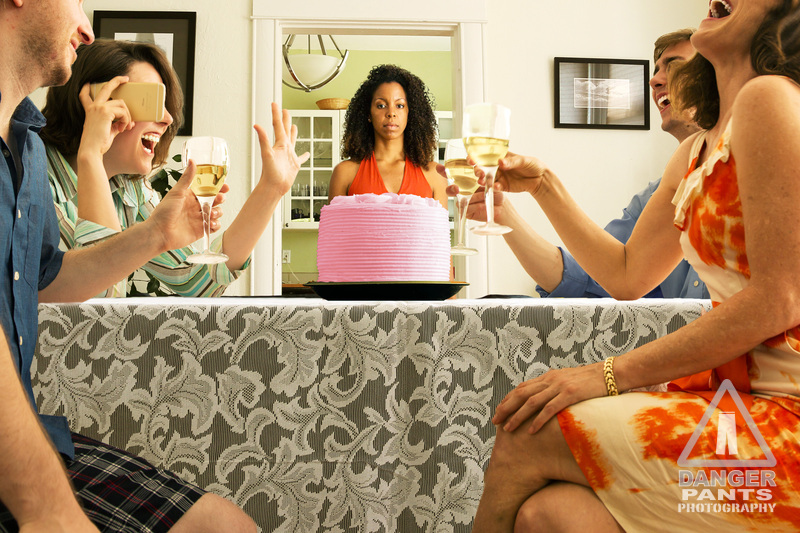
For these shots, I worked closely with Evelyn deHais (Annex’s marketing director) who came up with the concepts, and did some light retouching on the images before they went out to press. Evelyn’s concept was that we wanted to call to mind the perfect-looking, bright cheery world you typically see in sitcom press photos. The images would show Aretha, the subject of the show’s title, in various situations, waiting while people around her are having a good time, getting on with their lives. The image that we both ended up liking best was the one we called “Cake,” which calls forward to the pink cake as an element of the play.
Here’s the picture, as I finished it:
What I find really cool about this picture is the way that it’s made: this is a composite of eight different pictures. Look at it again. That’s eight different photos, layered together.
The photos are, in no particular order:
* The background shot: table, walls, etc.
* Yesenia, in the red dress, center
* Shane, far left, with water in his wine glass
* Evelyn, behind Shane, with the cell phone
* The cake, a lemon-yellow frosted cake
* Soren, in the blue shirt, with water in his wine glass
* Paige, far right, with water in her wine glass
* The tablecloth, behind Paige and Shane’s legs
All photos, fortunately, could be shot in the exact same light (heavily diffused west-facing windows, in the afternoon sun), which makes the compositing effort much easier. I was also able to set up the camera on a tripod for many of the shots, which ensures that the camera’s point of perspective doesn’t shift in weird ways.
Because of people’s schedules, we had to shoot Yesenia (woman in the red dress) first, then everyone else a week later, and the cake and table follow-up shots after that. Fortunately, we had the four models around the table at the same time, so shadows and lighting are very realistic without having to go to extraordinary lengths.
Each person was then cut out to separate them from the background, using a layer mask in Photoshop. If you’re following along at home, the new trick I learned in this process is a way to deal with hair and masking: select the subject, getting the edges as good as possible, but don’t stress too much about the hair. Just get the hair close. Then, hit the Refine Edge button. At least for me, it always comes up in a mode where I get a brush pointer out over the image — use this brush to tell Photoshop where it should be doing Edge Detection. That is, brush around the hair areas, where you want to see background through the hair. Like magic, Photoshop just selects the hair and leaves the background cut out. Click OK then hit the Layer Mask button at the bottom of the Layers panel, and you’ve got a really good layer mask.
In any case, each person was cut out of their individual photo and layered on top of the background image. The front tablecloth picture and the cake were layered on last. The tablecloth picture allowed the entire room to be in focus, as well as the front edge of the tablecloth — photos like this are frequently shot and assembled in such a way that absolutely everything is in focus, so that was an element I concentrated on preserving.
One of the problems was that the cake needed to be pink, but I couldn’t find a pink cake at the store (we needed to keep costs down and the schedule was tight, so no fancy bespoke cakes for us). Instead I found a yellow one that was about the right kind of simple-and-elegant, so I shot it and modified the color with the Photo Filter adjustment layer. I did the same thing to the water in the wine glasses, giving them approximately the color of white wine.
Because these photos were all shot in the same light, this was also one of the easiest photos to put together. We did six total press shots, and my lack of compositing experience definitely came to the forefront in the more extreme ones — I tried faking “daylight” in the studio with a softbox and a reflector, but really didn’t get it right. Photos which use studio shots look distinctly more fake than the Cake photo, although they do accomplish the goal of looking like heavily composited photos. I also made the mistake of shooting my models against black, thinking I could use a blending mode to blend them into the scene. Instead I needed to cut them out from the background, and it would have been much easier with a white or green background.
The other thing that occurred to me is that I would ideally have two photo shoots: one to get the approximate shots done, without too much concern for costume or makeup, but focusing as carefully as possible on positioning models and matching the lighting I need. I would then attempt to composite mock-ups of the photos we wanted to do, using the real backgrounds. This would make abundantly clear where I’d gotten lighting or positioning wrong, and then in the second shoot we could concentrate on making those right, as well as getting costume and make-up spot-on. It feels like a school exercise, and I’m sure experienced composite photographers do the first step in their head before they even start (or would only do the double shoot in bizarrely ideal circumstances, due to time or budget constraints).
Overall, I’m pleased with how they came out, given my nearly complete lack of experience going in. I don’t think I’ll be offering to do commercial compositing shots any time soon, but I’m glad to dip my toe in.

